


CSs 样式 边框样式


最佳答案
1
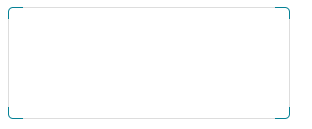
<html>
<head>
<title>特效</title>
<style>
.border {
border: 1px solid #058195;
width: 280px;
height: 110px;
position: absolute;
border-radius: 5px;
}
        .border:before {
            content: '';
            position: absolute;
            width: 90%;
            height: 100%;
            bottom: -1px;
            top: -1px;
            left: 5%;
            border-bottom: 1px solid #ddd;
            border-top: 1px solid #ddd;
        }

        .border:after {
            content: '';
            position: absolute;
            width: 100%;
            height: 80%;
            left: -1px;
            right: -1px;
            top: 10%;
            border-left: 1px solid #ddd;
            border-right: 1px solid #ddd;
        }

</style>
</head>
<body>
<div class="border">
</div></body>
</html>
收获园豆:10
其他回答(1)
0
我也是从别的地方看到的,互帮互助希望对你有用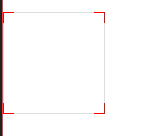
css部分:
.border{
border:1px solid #FF0000;
width:100px;
height:100px;
position: absolute;
}
.border:before{
content: '';
position: absolute;
width: 80%;
height: 100%;
bottom: -1px;
top:-1px;
left:10%;
border-bottom: 1px solid #ddd;
border-top: 1px solid #ddd;
}
.border:after{
content: '';
position: absolute;
width: 100%;
height: 80%;
left: -1px;
right:-1px;
top:10%;
border-left: 1px solid #ddd;
border-right: 1px solid #ddd;
}
html部分:
<div class="border">
</div>

再建四个小的元素,用绝对定位
– 绝品骚年 6年前